I wish I could sit down with you and work through a project to just answer any questions that come up. But since I can’t do that, how about I share some Graphic Designer’s Tips about Design Space.
These tips will help you feel more confident when designing your own visions in Design Space.
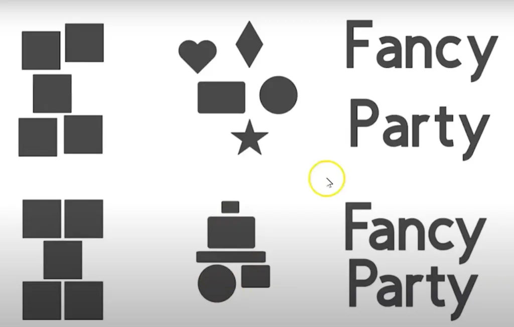
Look for funny gaps or uneven spacing in your design, and adjust objects as needed. Use the align tools, and ungroup letters to fill in extra space in words.

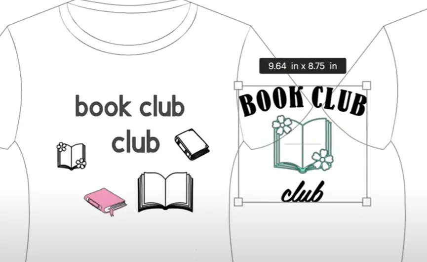
Compare the design on the left and the design on the right here:

The left has too much space, and too many things to look at – your eyes aren’t sure where to go first. On the right, there is one centered image, text on the top to read first, and text on the bottom to read second.
Today’s Tip: Advice from a Graphic Designer
- Spacing – create even spacing whenever possible.
- Focus – where do you want to look first? Use different sizes of objects and text, and don’t make it too busy.
Craft with your Cricut Joy or Xtra during this upcoming summit https://citr–blacksheep303com.thrivecart.com/cwcjoy-free-ticket/
